What’s that new look? The Kava brand evolution
If you’ve known Kava for some time you might be wondering, what’s with the new look? We are proud to share our refreshed branding, and we wanted to say a few words about it (we are a marketing agency after all).
As a full-service marketing, design and creative agency, branding is very important to us. Over the last 20 years we have developed many new brands for companies and refreshed existing ones so tackling our own was serious business. But why now?
The importance of this refresh was centred around Kava’s change of operating structure to an Employee Ownership Trust (EOT). As an agency with clients around the world, we should point out this is a UK based business structure, not dissimilar to a cooperative.
It’s a unique and ethical approach to structuring a business – one in which everyone in the organisation can benefit from the company’s success and growth. And we are proud to be one of a small but growing number of EOTs that are operating in the UK.
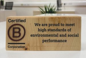
We are also working towards enhancing our ethical and sustainability credentials by obtaining B Corp accreditation because we believe that businesses want to work with other companies that are committed to doing the right thing for people and the planet.
As we like to point out to all our clients, a brand is much more than a logo and our brand refresh goes much deeper than a new colour palette and typeface. Our new logo was born from Kava’s heritage – demonstrating that this is an evolution of the business, not an entirely new brand.


Circles have been part of the Kava brand identity for many years and have been evolved to form the new logo. As if by happy coincidence the shapes not only form a graphical K, but one side of the K also forms a leaf-like shape – a nod back to the Kava name, which comes from the Kava plant, used to make the traditional national drink of Fiji. Bringing together all these elements in a new way symbolises Kava past and present, and its evolution that will take us into the next two decades.
Our new colour palette is inspired by nature, something we are lucky to be surrounded by at our offices in the Cotswolds, and the sea – a reference to octopuses and their many tentacles, our expression of the many services we offer our clients under one roof.
Coral is our new signature colour, symbolising the passion and energy we bring to our work. A supporting cast of vibrant accent colours is anchored by a deep ocean blue, representing the depth of our knowledge and the reliability of the services we provide.
The clean, modern new look also represents the new generation of employees within the business.
As the saying goes ‘There is nothing permanent except change’ and companies should not be afraid to evolve and update their brand when the appropriate time comes. If this sparks interest in reviewing or evolving your own brand, please reach out to talk to our team.